Creating your first flutter app - Part 3
Getting Started
We're going to pick up right where Part 2 left off. If you haven't already been through Part 1 and Part 2, you should check them out before going forward.
Download
Visit the GitHub repository to clone the source. You'll want to do this because there are over 1100 lines of code in the final app, and we won't be going over every line of code, just the important ones.
This post uses the step2 branch:
git clone https://github.com/killermonk/octal_clock_app.git
git checkout step2
Configuring the clock
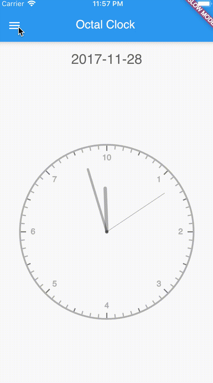
We are going to update our ClockPage to have a Drawer. We chose to put the configuration here so that it was out of the way. This way the user can just focus on the clock instead of always worrying about the configuration.

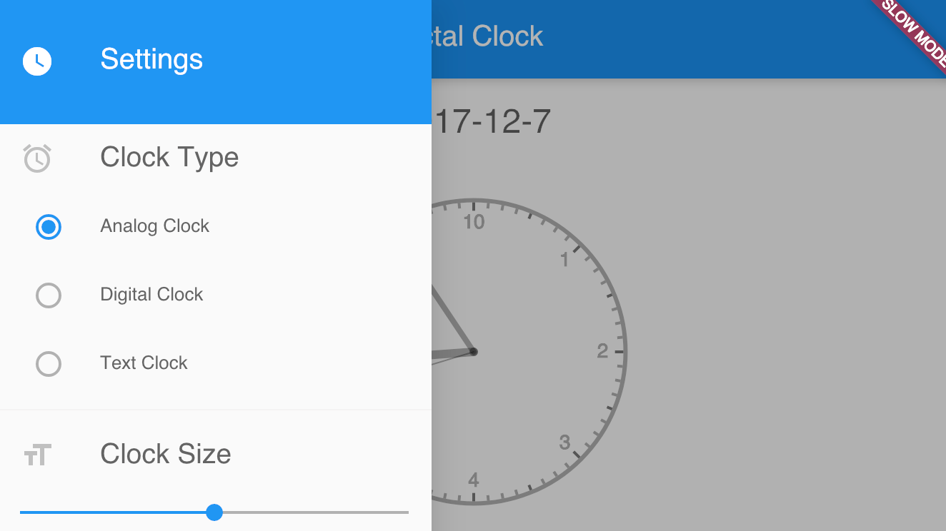
Let's talk about this drawer for a minute, so we have all our requirements out of the way upfront. As we see in the image of the final product, we are going to be configuring the type, size, and color. We use radio buttons for the clock type, a slider for the clock size, and simple color boxes for the color.
However, we have a UX issue. As you can also see in the image, the configuration drawer covers almost the whole clock face, making it extrememly difficult for the user to preview their changes. To fix this, we are going to make it so that during and for a short time after a config change, the drawer goes partially transparent.
Let's go ahead and create the Drawer now.
Clock Settings Drawer
We're only going to be touching on part of the code, get the full file from GitHub - clocksettingsdrawer.dart
A couple tidbits before we get into the code:
- This component is a widget, so it goes in
lib/src/widgets - The component needs to be Stateful, so that we can manipulate its Opacity.
- This is a "dumb" component, so it doesn't store any data. It receives our current values as properties and uses callbacks to inform the parent component that values have been changed.
Let's quickly define the types for callbacks when a given setting is changed:
typedef ClockTypeCallback(ClockFaceType type);
typedef ClockSizeCallback(double height);
typedef ClockColorCallback(Color color);
Now let's define our widget with these callbacks, the currently active values, and initialize them all as part of the constructor:
class ClockSettingsDrawer extends StatefulWidget {
ClockSettingsDrawer({
Key key,
this.activeType,
this.heightFactor,
this.activeColor,
this.onChangeClockType,
this.onChangeClockSize,
this.onChangeClockColor,
})
: assert(activeType != null),
assert(heightFactor != null),
assert(activeColor != null),
assert(onChangeClockType != null),
assert(onChangeClockSize != null),
assert(onChangeClockColor != null),
super(key: key);
final ClockTypeCallback onChangeClockType;
final ClockSizeCallback onChangeClockSize;
final ClockColorCallback onChangeClockColor;
final ClockFaceType activeType;
final double heightFactor;
final Color activeColor;
State createState() => new _ClockSettingsDrawerState();
}Now we're going to create our basic state for the widget. We're going to get everything ready for changing the opacity, but we're not actually going to change it around, yet.
class _ClockSettingsDrawerState extends State<ClockSettingsDrawer> {
/// The opacity of the drawer
double _opacity;
void initState() {
_opacity = 1.0;
}
Widget build(BuildContext context) {
final MediaQueryData mediaQuery = MediaQuery.of(context);
final ThemeData themeData = Theme.of(context);
return new Opacity(
opacity: _opacity,
child: new Drawer(
child: new ListView(
primary: false,
children: <Widget>[
new Container( // Fake a drawer header
color: themeData.primaryColor,
padding: new EdgeInsets.only(
top: mediaQuery.padding.top + 16.0, bottom: 16.0),
child: new ListTile(
leading: new Icon(Icons.watch_later,
color: themeData.primaryTextTheme.title.color),
title: new Text(
'Settings', style: themeData.primaryTextTheme.title),
),
),
],
),
),
);
}
}While the the Scaffold's drawer is typically a Drawer, it doesn't have to be. We took advantage of this to use Opacity as the root of our drawer. If you change the default value of _opacity, you can see how it changes the appearance of the drawer.
Additionally, notice the // Fake a drawer header comment on line 21 above. Typically, the first child of the ListView is a DrawerHeader. Since we're just showing an icon and some title text, I personally felt like the DrawerHeader just took up too much space by default and it was cleaner to just make my own instead of modifying all the padding and margins for the DrawerHeader.
Now, we're going to add in the handling for _opacity. Our desired behavior is as follows: When the user is actively modifying a setting the Drawer should become partially transparent so they can see how the appearance of the clock changes. Shortly after the user finishes changing the setting, the drawer becomes fully opaque again. To do this, we are going to build our own simple debounce handling into the state.
Timer _opacityDebounceTimer;

_setOpacity(double opacity, {int debounce}) {
  void doWork() {
    setState(() {
      _opacity = opacity;
    });
  }

  if (debounce != null) {
    _opacityDebounceTimer?.cancel();
    _opacityDebounceTimer = new Timer(
      new Duration(milliseconds: debounce), () {
        doWork();
    });
  } else {
    doWork();
  }
}
The _setOpacity method will execute immediately if no debounce argument is given. Otherwise, it waits until debounce milliseconds have passed without the method being called before executing.
Next up, we get to create each of the three settings sections that the user can actually interact with.
Clock Type Settings
Since we're going to have three different radio buttons for this setting, we're going to use a method for the update to keep things DRY. We'll make the panel mostly transparent as soon as the setting is changed, then wait a second before changing it back to fully opaque.
_changeClockType(ClockFaceType type) {
  widget.onChangeClockType(type);
  _setOpacity(0.25);
  _setOpacity(1.0, debounce: 1000);
}
Now, we add our children to the build method just after our "fake" drawer header:
            // Section Heading
            new ListTile(
              leading: new Icon(Icons.alarm),
              title: new Text('Clock Type', textScaleFactor: 1.5),
              dense: true,
            ),
            // Section Content
            new RadioListTile(
              value: ClockFaceType.analog,
              groupValue: widget.activeType,
              onChanged: _changeClockType,
              title: new Text('Analog Clock'),
              dense: true,
            ),
            new RadioListTile(
              value: ClockFaceType.digital,
              groupValue: widget.activeType,
              onChanged: _changeClockType,
              title: new Text('Digital Clock'),
              dense: true,
            ),
            new RadioListTile(
              value: ClockFaceType.text,
              groupValue: widget.activeType,
              onChanged: _changeClockType,
              title: new Text('Text Clock'),
              dense: true,
            ),
            new Divider(),
Our groupValue is the currently configured value, as passed to the widget. This is changed when _changeClockType is called. Our value is the value represented by the Radio button. When groupValue and value are the same, the Radio is considered to be selected.
Clock Size
Now we add in the slider for our Clock Size. Remember that this slider represents a configurable range for each clock type. It was the most straight forward to just have it represent the values 0 to 100 instead of changing based on clock type.
            new ListTile(
              leading: new Icon(Icons.format_size),
              title: new Text('Clock Size', textScaleFactor: 1.5),
              dense: true,
            ),
            new Slider(
                value: widget.heightFactor,
                onChanged: (value) {
                  widget.onChangeClockSize(value);
                  _setOpacity(0.25);
                  _setOpacity(1.0, debounce: 1000);
                }
            ),
            new Divider(),
Clock Color
Lastly, we configure our clock color.
(At the time I wrote this, there wasn't a nice color picker that I could find and use, so I just threw something together quickly. I'm not really going to go over its code, since its just rendering a bunch of Containers with fixed sizes and background colors. Material Pickers has since been published. I leave it to you, dear reader, to implement it. I may write an article on it later.)
            new ListTile(
              leading: new Icon(Icons.color_lens),
              title: new Text('Clock Color', textScaleFactor: 1.5),
              dense: true,
            ),
            new ListTile(
              title: new ColorBoxGroup(
                width: 25.0,
                height: 25.0,
                spacing: 10.0,
                colors: [
                  themeData.textTheme.display1.color,
                  Colors.red,
                  Colors.orange,
                  Colors.green,
                  Colors.purple,
                  Colors.blue,
                  Colors.yellow,
                ],
                groupValue: widget.activeColor,
                onTap: (color) {
                  widget.onChangeClockColor(color);
                  _setOpacity(0.25);
                  _setOpacity(1.0, debounce: 1000);
                },
              ),
            ),
The ColorBoxGroup is my horrible class. We give it a list of the 7 colors we support as colors, we give it the current color as groupValue (because using something like value would have just made too much sense), and then we handle changing the color in our onTap.
Now that we have our drawer fully built, we just need to plug it into the Clock Page and we're done.
We need to create our three callbacks to actually handle when the drawer tells us a value has been changed. Add these to our _ClockPageState.
  void _updateClockType(ClockFaceType type) {
    setState(() {
      _type = type;
    });
  }

  void _updateClockSize(double heightFactor) {
    setState(() {
      _heightFactor = heightFactor;
    });
  }

  void _updateClockColor(Color color) {
    setState(() {
      _color = color;
    });
  }
Then we plug the drawer into our Scaffold in our build method.
      drawer: new ClockSettingsDrawer(
        activeType: _type,
        heightFactor: _heightFactor,
        activeColor: color,
        onChangeClockType: this._updateClockType,
        onChangeClockSize: this._updateClockSize,
        onChangeClockColor: this._updateClockColor,
      ),
Now we need a way to actually open the drawer. Thankfully, our Scaffold is smart enough to handle this for us, we just need to remove our leading icon from the AppBar and let the magic happen, so remove the following line:
leading: new Icon(Icons.watch_later),
Tada! Magic! We now have our fully functional App Drawer to control the settings of our clock!